OP.

Case study

Systemic Risk Assessment Platform

Systemic risk assessment often requires expert teams to navigate complex, interconnected frameworks. I translated a research methodology, originally documented across spreadsheets and guidance materials, into a clear, collaborative digital platform for exploring risks, assessing responses, and identifying areas for improvement.

Laptop showing the platform's home page, “Explore, Assess, and Respond”, against a starry lake landscape

The Challenge

Turn a complex research methodology, originally documented across spreadsheets and PDFs, into a clear and flexible digital assessment experience.

Duration

~3 months

Product status

Live · Continued development

My role

UX/UI Designer — UX structure, information architecture, wireframes, final UI, visual direction, stakeholder collaboration.

Users

  • Research & policy professionals
  • Expert teams
  • Civil society organizations

Constraints

  • Complex expert methodology
  • Non-linear assessment
  • Collaborative use
  • Specialized terminology
  • Development constraints

Key decisions

  • Modular assessment navigation
  • Collaborative workspaces & sessions
  • Actionable results

Outcome

Prototype tested at the Global Symposium → continued development → live digital tool.

What I would improve

Evolve the workspace into a dedicated web application for ongoing assessments, saved results, and richer team collaboration.

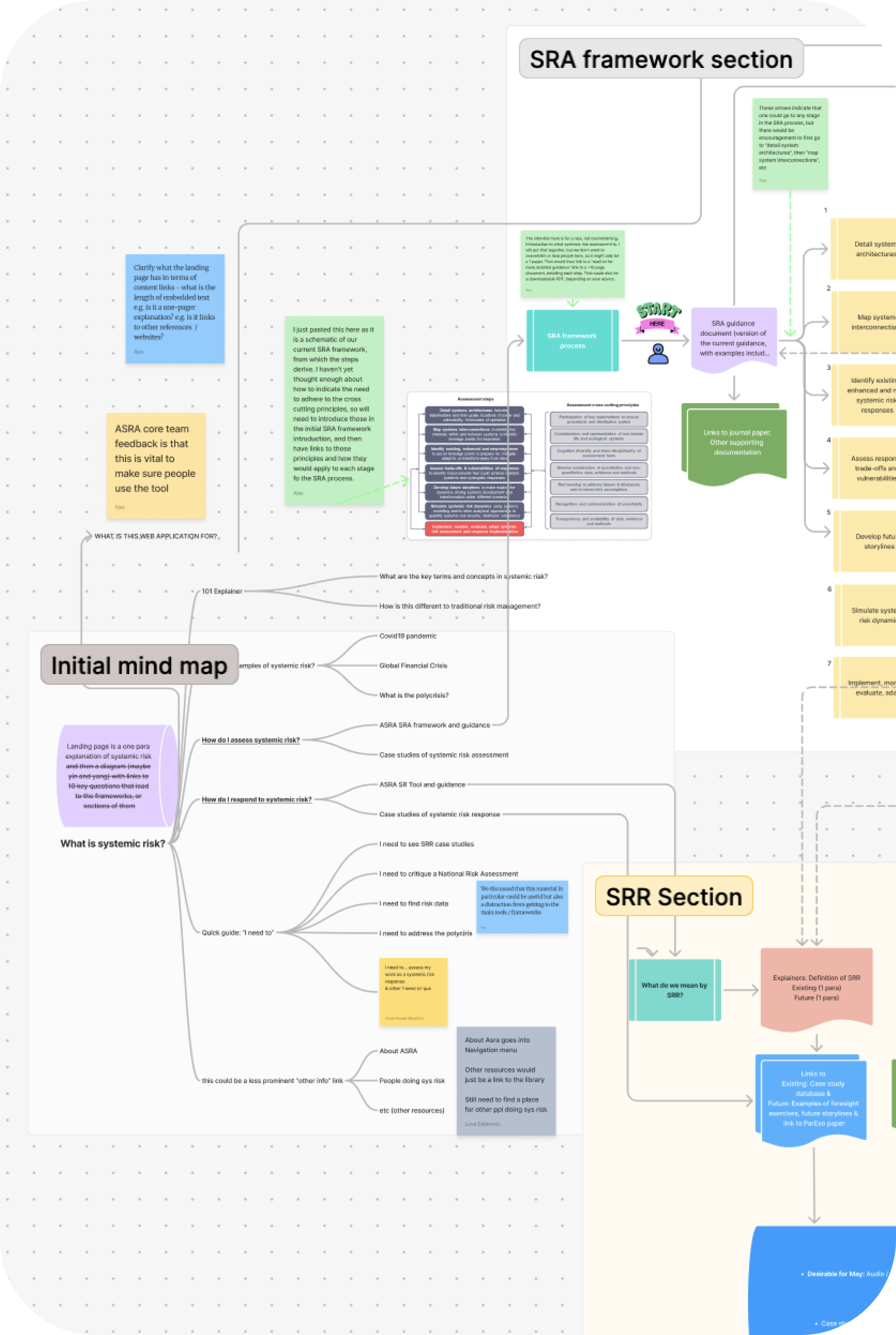
Initial mind map mapping the SRA and SRR framework sections, user questions, and content structure
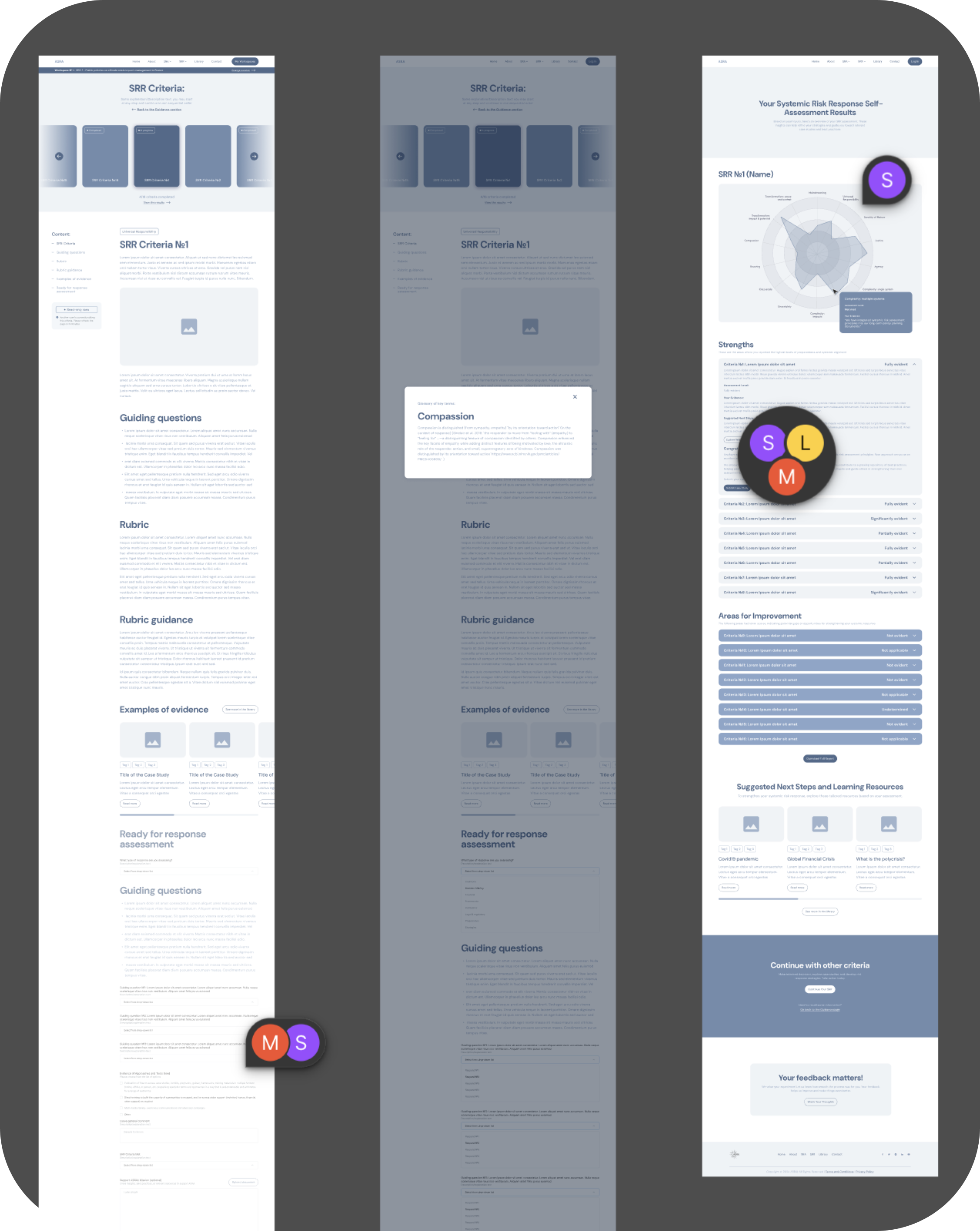
Three wireframes of the SRR criteria and assessment results pages

The Context

Starting with a methodology, not a product

The project began with an established systemic-risk methodology, but not a digital product. The framework lived across an Excel-based assessment tool, guidance documents, and supporting case studies. The ASRA team had deep expertise in the research, but the digital structure and user experience still needed to be defined.

My first task was to understand that logic well enough to translate it into a usable experience. Working with the project team and domain experts, we mapped the framework, clarified terminology and flows, and defined how guidance, assessment, collaboration, and results could work together.

Mapping the Framework

Bringing two frameworks into one coherent experience

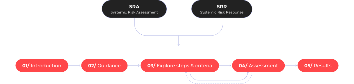
The platform combined two connected frameworks — Systemic Risk Assessment (SRA) and Systemic Risk Response (SRR). Each had its own guidance, assessment structure, supporting evidence, and logic, while users needed enough flexibility to move through the content in different ways.

We translated both frameworks into a shared product structure: introducing the methodology first, providing guidance where needed, and then leading users into a modular assessment experience with clear access to results.

SRA (Systemic Risk Assessment) and SRR (Systemic Risk Response) merge into one shared experience structure: 01 Introduction, 02 Guidance, 03 Explore steps & criteria, 04 Assessment, 05 Results, with a loop between steps 03 and 04

Design Constraints

Complex expert logic had to become a clear, flexible experience

01/

Complex expert methodology

The interface had to make a highly specialized systemic-risk framework easier to understand and use without oversimplifying the methodology behind it.

02/

Non-linear assessment logic

SRA steps and SRR criteria did not follow one fixed sequence. Users needed to move between sections, skip areas, return later, and still maintain a clear sense of where they were.

03/

Collaborative assessment

Assessments were often completed by teams rather than individuals, with different members contributing expertise across different parts of the framework.

04/

Technical and delivery constraints

The product structure had to support shared workspaces and multiple assessment sessions while remaining feasible to develop within the project’s scope and timeline.

Key Product Decisions

Designing flexibility into the assessment experience

01/

Making a non-linear assessment easy to navigate

Evidence

The SRA and SRR frameworks were intentionally non-linear. Users could work through individual steps or criteria in different orders, skip areas, return later, and view results before completing the full assessment.

Insight

Each part needed to work independently without feeling disconnected. While users could focus on individual areas, completing more of the framework created a more complete picture of the system being assessed.

Design decision

I designed the assessment around modular step and criterion cards, supported by clear progress states and flexible navigation. Each area could be opened and completed independently, allowing users to move through the framework in the order that best matched their needs while still staying oriented within the overall assessment.

SRR Criteria page with modular criterion cards and progress states, next to the “Ready for response assessment” form

02/

Designing for teams, not only individuals

Evidence

Stakeholder discussions showed that assessments could be completed individually, but were often collaborative. Different team members might contribute expertise to different parts of the framework, while the same individual or team could also run several assessments over time.

Insight

A purely individual account model would not reflect how the tool was actually used. The experience needed to stay simple for solo users while also supporting shared access, multiple contributors, and separate assessments for teams.

Design decision

We introduced workspaces that could be used individually or shared with collaborators. Each workspace could include invited members and multiple SRA or SRR sessions, keeping different assessments organized within one shared environment.

How the model evolved

The initial account structure was designed mainly around individual use. As stakeholder feedback clarified how assessments were completed in practice, the model evolved into shared workspaces that could support both solo and collaborative use without creating separate product flows.

My Workspaces page showing a shared workspace with invited members and separate SRA and SRR sessions

03/

Turning assessment input into actionable results

Evidence

Users could view results even before completing every step or criterion, so the outcome needed to remain understandable and useful at different stages of the assessment.

Insight

Completing the framework was only valuable if users could quickly understand what their responses meant, identify stronger and weaker areas, and use the outcome to support further discussion.

Design decision

The tool translated assessment inputs into an automated visual summary, highlighting strengths and areas for improvement. Users could review results at any stage and export them as a structured PDF report to share, discuss, and use beyond the platform.

Tablet showing SRR self-assessment results with a radial chart of the 14 criteria and a criterion detail tooltip

Visual Direction

A visual language built around perspective and connection

Perspective shiftTwo visual worldsFragments to whole

The visual language was designed to do more than give the platform a distinctive look. Photography, composition, and image treatment were used to reinforce the idea of changing perspective, connecting individual dimensions, and building a more holistic view of systemic risk.

01/

A different perspective

Inverted and reflected landscapes became a visual metaphor for looking at familiar systems from another angle — questioning assumptions and revealing relationships that may not be immediately visible.

Platform screens in both visual worlds: light SRR pages with coastal imagery and dark navy SRA pages with mountain imagery

02/

Distinct visual cues

The two frameworks shared the same overall design system but used different visual cues to make them easier to recognize. SRA leaned toward dark navy surfaces and mountain imagery, while SRR used lighter treatments and coastal photography. The distinction remained flexible, with lighter backgrounds used on content-heavy screens where readability was the priority.

03/

From individual parts to a holistic view

Assessment cards were designed as fragments of a larger landscape. Each step or criterion could stand on its own, while the complete imagery on the results page reinforced the idea of bringing separate dimensions together into a broader, more holistic view.

The visual system made the product logic visible — separate perspectives, connected into a broader picture.

Launch & Reflection

From prototype to a live collaborative assessment platform

Outcome

The interactive prototype was presented at a global symposium in Paris, where participants could explore the assessment experience directly. Following the event, development continued and the product evolved into a live digital platform that is still being refined and expanded.

Stakeholder feedback was consistently positive, particularly around the clarity of the interface and the way a complex expert methodology had been translated into a structured, usable digital experience.

Reflection

The biggest challenge was not designing the interface itself, but understanding the methodology deeply enough to make it understandable for someone else. Working closely with domain experts reinforced how much UX design depends on translating specialist knowledge into clear product logic before translating it into screens.

If I continued the work, I would evolve the tool into a dedicated web application, separating the assessment workspace from the public-facing website and giving users a persistent environment for ongoing assessments, saved results, team activity, and previous sessions.

Laptop showing the “What are SRA & SRR?” page, with the “How SRA & SRR Work Together” cycle and expert testimonial sections below
Sunlit canyon walls framed through a circular reflected cut-out