OP.

Case study

Connected Sports Platform

Purpose-driven sports challenges bring together participation, activity tracking, fundraising, and community engagement across multiple touchpoints. This platform brought those experiences together across web and mobile, helping participants, organizers, and campaign owners take part in sports challenges from anywhere.

Product name and selected details have been anonymized.

The Challenge

Transform an existing remote-racing mobile app into a broader web + mobile platform supporting sports challenges, fundraising, campaigns, and multiple user roles.

Duration

Dec 2025 - Present

Product status

Launched · Ongoing evolution

My role

Led UX/UI for the new web platform and evolving mobile experience, including IA, key flows, UI system, and rebrand. Worked closely with the CEO, PM, developers, and stakeholders.

Users

  • Participants & teams
  • Organizers
  • Charities / campaign owners

Constraints

  • Existing mobile product
  • Evolving scope
  • Multiple user roles
  • Different challenge rules
  • Third-party integrations

Key decisions

  • Campaigns & personal fundraising
  • Multi-sport challenges
  • Community & shared participation

Outcome

Launched web platform, evolved mobile experience, new fundraising and challenge flows, and a reusable brand and UI foundation.

What I would improve

More structured usability testing and product analytics across key cross-platform journeys.

Web platform home page with a race hero banner, open race registrations, and organizations to support
Mobile app race detail screen showing event dates, distances, location, and race type

The Context

Expanding beyond remote races meant rethinking the product around new roles, formats, and ways to participate

The original mobile app was built around remote race participation. As the scope expanded, it needed to support campaigns, challenges, fundraising, different sports, and new user roles — each with its own flows and needs.

I designed a new web platform from the ground up, then adapted the mobile experience to fit the expanded model and connect participants, organizers, and campaign owners within one ecosystem.

Research & Product Direction

Exploring adjacent product models helped define how participation, event creation, and fundraising could work together

Race participationEvent organizationFundraising

I analysed the existing product and benchmarked adjacent platforms across race participation, event organization, and fundraising. I compared discovery, registration, creation flows, navigation, fees, trust signals, and sharing patterns.

This helped identify familiar interaction patterns that could work together within one platform, while highlighting where the three models required distinct journeys.

01/

Clear entry points matter

Specialized products were easiest to understand when the primary action was immediately clear.

02/

Different roles need distinct journeys

Participants, organizers, and people creating fundraisers entered the platform with different goals and needed clear entry points for each journey.

03/

Fundraising is a complete product flow

Goals, beneficiaries, fees, trust, progress, and sharing showed that fundraising could not be treated as a simple add-on to event participation.

The opportunity was to connect three familiar models without making the platform feel like three separate products.

Defining the Product Ecosystem

From separate models to one ecosystem

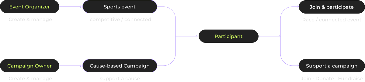
The initial research clarified three adjacent models behind the product vision: race participation, event organization, and fundraising. Each model came with its own logic, audiences, and flows, which made the product direction more complex than a typical remote-racing app.

The next step was defining how these models could work together inside one coherent ecosystem without feeling like separate tools. This exploration later expanded into challenges and multi-sport participation, opening new ways to engage beyond a traditional race.

User Research

Once the product model began to take shape, we looked at what remote participation was still missing.

Later in the process, the PM led approximately 8–10 semi-structured interviews in French with people involved in sports to explore motivations, participation habits, and pain points around remote formats. I helped shape the interview questions, joined selected sessions, and worked with the findings to identify product and design opportunities.

01/

Shared participation matters

Remote formats could feel isolated without visible signs of others taking part.

02/

Progress beyond competition

Users valued personal progress, not only rankings against others.

03/

Make remote participation feel real

Bibs, finish moments, and sharing made the experience more tangible.

04/

Bring the experience together

Users wanted participation, activity, and progress to feel more connected.

These findings shifted the focus from simply enabling remote participation to making it feel more connected, visible, and meaningful.

Design Constraints

The platform had to grow without losing the simplicity of its original participation experience.

01/

Existing product foundation

The new web platform had to extend existing remote-race logic, while keeping familiar participation patterns recognizable to existing users.

02/

Different roles, different levels of complexity

Organizers, campaign owners, and participants needed different permissions and entry points without making the platform feel like separate products.

03/

An evolving product model

As the product expanded, new participation models and user needs had to be integrated into an experience that was already evolving across web and mobile.

04/

Existing activity integrations

The expanded web and mobile experience had to remain compatible with existing activity tracking and external sports integrations.

Rebranding the Product

Designing an identity for what the product was becoming

As the product expanded beyond remote racing into challenges, fundraising, and multi-sport participation, the existing brand no longer reflected what the platform was becoming.

I led the rebrand alongside the product redesign, defining the visual direction, colour system, typography, logo, and UI foundation for web and mobile.

Key Product Decisions

Turning the expanded product model into clear participation experiences

01/

Connecting campaigns and personal fundraising across roles

Product context

The expanded platform introduced cause-based participation across campaign owners, event organizers, and individual participants.

Insight

These roles needed different levels of control: organizations required structured ownership and verification, while participants needed a lightweight way to support an already approved cause.

Design decision

I separated the flows: verified organizations could manage campaigns, organizers could connect events to existing beneficiaries, and participants could join, donate, or create a personal fundraiser linked to an existing campaign.

02/

One challenge. Different ways to move

Product direction

The original product was centered around races and running. As challenges were introduced, participation needed to open up to people with different sports and activity habits.

Insight

If challenges inherited traditional race logic, they would still primarily serve runners. Different activities needed to feel equally valid within the same challenge experience.

Design decision

I designed challenges as a flexible multi-sport format where organizers could define the accepted activities. For distance-based challenges, every kilometer contributed equally to the shared goal, regardless of whether it came from running, cycling, swimming, or another supported sport.

Challenge creation screen showing a range of selectable activity types, from walking and cycling to indoor swimming and paddling

03/

Making remote participation feel real and shared

Research finding

User research showed that remote participation could feel isolated and less tangible than taking part in a physical event. Participants missed visible signs of others taking part, recognition, and moments worth sharing.

Insight

Recording an activity was not enough to create a sense of participation. People needed to see that others were involved too, and to have visible moments that made their own effort feel recognized and worth sharing.

Design decision

I introduced a more visible social layer across the experience: community maps made participation visible, collective progress reinforced the shared effort, and Digital Bibs and sharing moments gave participants individual recognition.

Phone screens showing a confirmed race registration with a personal digital bib number
Community in action map showing participant activity shared across many countries

Iteration Spotlight

Making community visible while protecting participant activity

Public communitySigned-in detailsApproximate locations

Initial concept

The first concept made participant activity and shared moments directly explorable from the community map.

Concern

This made the experience feel social and immediate, but raised privacy concerns around making participant-level activity visible to anyone visiting the campaign.

Iteration

We kept the overall community visible publicly, while requiring sign-in to explore individual participants and their shared content. Activity locations remained approximate rather than precise.

Final decision

Keep the community visible at a glance, while protecting participant-level details behind signed-in access and avoiding precise location data.

Access gate screen prompting sign-in to explore community participants and their shared moments on the map
Signed-in community map experience showing participant activity, approximate locations, and shared moments

Launch & Product Evolution

The new platform launched as a foundation that continued to evolve across web and mobile

The new web platform brought events, campaigns, fundraising, and organizer tools together in one place, establishing the core structure beyond the original remote-racing app.

The product continued to evolve through challenges, multi-sport participation, community features, and an updated mobile experience, with new functionality still being added.

Outcome & Reflection

A broader product, built around more ways to participate and connect

Outcome

The new web platform launched with campaigns, fundraising, multi-sport challenges, and organizer tools, alongside an evolving mobile experience. The product is now used by client organizations and continues to grow through new features and ongoing feedback.

The rebrand and reusable UI foundation also created a more consistent experience across web and mobile.

Reflection

The biggest challenge was not designing individual features, but making an expanding product feel coherent across different roles and ways of participating.

If I continued this work, I would introduce more structured usability testing and product analytics earlier, especially across key cross-platform journeys. The project reinforced the importance of validating an evolving product model continuously rather than only refining individual features.

Phone resting on rock showing the Support a Cause screen with active fundraising events
Two runners mid-stride, photographed in motion